Category Archives: User Experience

The absolute helplessness of Tier 1 support

I just got a new phone. I held off as long as possible because it just seemed wasteful when the old phone worked fine. It seems like the network support for sub-5G phones is decreasing though – and that impacts my experience.

My old phone was old enough that it didn’t support eSIM, which I discovered was a problem when I was in London buying a short term plan.

So when I got an error while trying to activate newPhone, I had an inkling this was probably the issue.

I opened a support chat with this info “I have oldPhone, which doesn’t support eSIM, and I suspect that’s preventing activation of newPhone” – but with more details.

Friends, it took 40 minutes of troubleshooting to come to a conclusion, and yes, that was it.

I was frustrated. My experience has been that trying to steer just slows down the process through the support tree. And so it feels helpless. I can’t get them to do the thing faster and so I have to sit.

I am empathetic though – following the support tree is required for the job, and they won’t get fired for following it. I sense that they, too, feel helpless- they cannot take a short cut.

Of course this lends itself to being a position that is automated away, since there is little benefit to having a human typing the words they don’t come up with.

And at the end of the, of course, they tried to sell me insurance.

Glenn Beck and the new reality of video distribution

My man Jamie Dubs did a great talk at the XOXO fest on how Glenn Beck is the unloved rockstar of the new media landscape. Jamie did the amazing VHX.TV, worked on Add-Art, started Know Your Meme, led the Internet Famo Class… He’s the Kevin Bacon of my internet, but everyone has a max Jamie number of 3.

Anyway, get your learn on:

Greasemonkey Hack: Adding tags and autosuggest to trunkly

The Backstory

del.icio.us was awesome. It was my first introduction to truly social software. It was my first introduction to tags and folksonomy vs. taxonomy – which blew my tiny mind.

And it was useful. Immediately, quickly, crazy useful. You could find the stuff you had seen! You didn’t have to be on the computer you had originally seen things on! You could bubble up lists of things you were interested in! I was struck with love.

Then Yahoo bought it and did the thing that Yahoo does to promising and interesting websites. It starves and kills them. So delicious is now getting bought by AVOS.

The New Thing

I’ve moved on and Trunkly looks like the best replacement so far. It is free, they will import all of your delicious bookmarks, scrape your twitter and facebook feeds, and one of the first things they built was a way to get your stuff back out of the site. I always like to have an exit strategy. I suggest trunkly as a delicious migration. The developers are really responsive and they have the freedom right now to do new and surprising improvements.

Not a small benefit: It is EARLY and short names on trunkly are available. So I was able to get http://trunk.ly/mk

Finally, the Point

The trunkly submit bookmark form is a bit crap though. I fixed it. See:
ungreased_trunkly
Turns into:
greased_trunkly_tags

You need the Firefox browser and the excellent Greasemonkey addon. Got those installed?

Great – now click here to install Autosuggest Tagging for Trunkly.
. You can always see the source or file bugs on it at the UserScripts.org page.

How Ning made me a chump and how you can avoid it

The problem with Software as a Service is you don’t own it.

You get it for free, but you don’t have a stake and you don’t have negotiating power.  Instead, try to work with services that give you an exit plan or that have the safety stamp of an aGPL license. 1

Who cares?

Vim pretties up with the Vivid Chalk theme.Let me back up and tell you a story about a social network I created.  Two big-time development bloggers, Jeff and Scott, were writing posts back and forth about how what colors they liked in their text editors and what fonts they used.

I’m not kidding, this is important in a job where most of what you do is sip coffee and type.  I’ve certainly killed some time messing about with how I color my  source code. Continue reading How Ning made me a chump and how you can avoid it

  1. The Autonomo.us project has a great list of alternatives that either AGPL or CC or something you can use.  Check out this guide to replacing what you are using now with services that keep you free.  (back)

Better Berkeley Webcasts even better

Nate Whitten wrote in with a suggestion for Better Berkeley Webcasts.  He wants to save all of the files to check them out later.  He’s using a download manager like Down Them All 1, but Berkeley’s files are named poorly, so he doesn’t know which one to watch first.

Even better, he sent in the fix for it – he’s numbered the download links.

You should download it from me, or over on the UserScripts.Org page.  As always, you’ll need Firefox and Greasemonkey.

  1. my favorite, you should check it out  (back)

It’s all details

They say the devil is in the details. Sometimes subtle details are a place to shine.

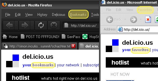
I was reading notes on a lecture by the great Joshua Schachter, developer of Del.icio.us, when I was thunderstruck by a detail.

You have to speak the user’s language. “Bookmarks” are what you call them if
you use Netscape of Firefox – most users these days know the term “favourite”
instead. Half of his population (? users) didn’t know what a bookmark was.

It is true:
The small details matter

Making the switch to Ubuntu

Yesterday morning, the 7.10 version of Ubuntu was released. It’s supposed to be chock full of goodness, so my neighbor Lawyer Matt and I had an install party with Aaron and Ian.

I dug out an old IBM Thinkpad T20 laptop that had been lying around and we got to it. I’d tried various Linux installs before, including Ubuntu. It always got down to having to know far to much about the internals than I wanted to.

This was a huge difference. The basic install went very smooth. I hit one snag. This old laptop had a PCMCIA wifi card that wasn’t recognized. Aaron found the solution for my Linksys WPC54G on the Ubuntu forums. With that out of the way, it is working. I’m impressed by how simple and smooth the experience is so far. Of course, the experience so far is mainly checking gmail, playing a movie, and writing this post.

Turn Ads into Art with AddArt

What if fox news could just be more blatantAnother great idea from the folks at Eyebeam.  Take the idea of one of the most popular extensions for Firefox, AdBlock, but remix it to display art placeholders instead of blank space.

Instead of crappy banners, Fox news gets an eagle flying with an American Flag!

Now, this isn’t a final product – it’s still being worked on.  I’ve sent them a mail offering development help if they need it.  I love this idea.

Alienware’s m5550 laptop: Vista Unready

There is an undocumented problem with their m5550 laptop. When the laptop goes to sleep – a feature that’s materially important to a modern laptop – wifi is disabled. When the laptop wakes up, the wifi doesn’t work. There is no way to bring it back but to reboot the laptop. Alienware’s position on this is that it is Microsoft’s problem, not theirs, and that there is no remedy available to you except to wait till Microsoft fixes the problem.

I was trying to do a nice thing for my partner Sam and buy her a new laptop. I got her an m5550 laptop from Alienware, and was excited to recieve it. When we discovered that the wifi doesn’t work on Alienware’s m5550 laptop, it was disappointing, but I was confident that we could find a patch or other solution. I went onto Alienware’s customer and tech support forums to find a solution. These forums are private, so potential customers can’t find them. This is the only place where Alienware admits the problem. I contacted Alienware tech support and they confirmed there is no technical solution to the problem. The earliest posting on it is from November 2006.

I’ve spoken with three different people from Alienware including Supervisor Kate. All confirm that Alienware’s position is that this is not their problem.

  • I bought the hardware from Alienware.
  • I bought the operating system from Alienware.
  • Alienware advertises the wifi card on the ordering page of their anti-wifi laptop.
  • Alienware doesn’t disclose the problem to potential customers.
  • Alienware’s promotional copy promotes their quality.

Also, from their promotional copy:

With every Alienware system, you are assured to receive components guaranteed to work optimally with each other, thus minimizing the possibility of technical issues and allowing you to start using your system immediately.

This sucks. I would like them to offer either a switch to XP, to take the laptop back without the 15% restocking fee, or to offer some other solution. Perhaps throw in a wifi PCMCIA card that they know works with the laptop and operating system?

Just about anything would be better than hearing that it isn’t Alienware’s problem and that I should just wait for a patch from Microsoft. They’ve known about the problem since November and it isn’t fair to treat their customers this way.

Please let your computer buying friend’s know about this problem and their response. I’d hate for other folks to be take for a ride…

Design: Paradox of Choice

Here’s a simpler explanation of the usability design principle of avoiding choice.
Joel from Joel On Software just wrote a great and simple explanation of the Paradox of Choice.
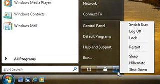
It all centers on what is wrong with this picture. Why are there that many options to choose from when you want to shut down?

Every choice presented to you is something you have to evaluate. That evaluation takes time and brain power. Whenever possible, we should make the choices very very easy and few for the user. Things should “just work”.

It is true – the iPod, a battery powered device, doesn’t have an off switch. Why are there so many ways to shut down my computer? These choices require 3 separate clicks – Start -> Little Arrow -> Actual Choice.

Joel argues for reducing everything to a “B’Bye” button. One click and it prepares the computer for you being away. And it’s just that simple. The task is “I’m trying to leave my computer.” Therefore the design should not force the user to interact more with their computer!

I’d only complicate this by putting in a place in the control panel where you can configure this behavior if you care enough to do it.

As I write more on user experience, I’ll put these posts under the label “User Experience”. If that’s all you are interested in, you can go here for just user experience posts.