Family
Went down to SC for Memorial Day with Max Lazer and spent time with my parents and some friends. My folks are having a tough time with Dad recovering from a stroke and a fall. My friends seem to be doing great – got to see lots of little babies.
Max was great at traveling – and seemed really adventurous at the pool, jumping off into the water. Of course, there was also the time he dog-paddled backwards until he was over his head and almost drowned( he didn’t).
Code
In-Cell Stacked Bar Charts in Excel
At work I was trying to present how different groups balance their resources – how many high, medium and low priority issues they have. We had a big table, and then wanted to have one of the cells be a stacked bar chart of the ratio between issues per group. Just an in-cell sparkline style stacked bar chart. Sparkline describes small, word-sized graphics, a term coined by Edward Tufte in Beautiful Evidence.
Excel does sparklines, but not stacked bar charts, not that I can find. You can create multiple charts and try to attach them to cells, but that is an uphill way to work and breaks every time you change the format or charting of the data.
I was inspired by some clever ideas people had for creating in-cell bar charts before Excel supported sparklines. I was also inspired by Zach Holman’s Spark, which uses unicode to produce commandline bar charts, like so: â–▂▃▅▇
I looked at using rept(“|”,datapoint), but you can’t change formatting with a formula within one cell. I also thought you could use a grid of cells and use conditional formatting to color cells to force a rough graph.
Then one of my colleagues mentioned Unicode and everything snapped together. There are 3 specific Unicode values in the Block Elements Unicode Block that are full glyph width but have visual difference: â–‘ , â–’ , and â–“ .
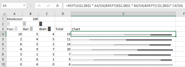
With that, you can put together a rough stacked bar chart in a cell.

One of the keys here is to make the blockcount very high and then shrink the font size – that way you smooth out the bars and hide the inevitable accumulation of rounding errors. The very right edges of those cells are a wee bit wiggly because of this.
